
TL;DR:
- Mastering Japanese-inspired palettes requires understanding tone, texture, and natural harmony, not just neutral shades.
- Building a cohesive look involves layering muted values with intentional accents, emphasizing light and texture.
There is a particular frustration that comes with admiring Japanese streetwear or minimalist aesthetics online, then attempting to recreate that effortless restraint in your own wardrobe — only to end up looking washed out, unintentional, or simply forgettable. The problem is almost never the garments themselves. It is almost always colour. Mastering Japanese-inspired palettes is not about choosing the most neutral beige or the darkest black. It is about understanding proportion, nuance, and the deliberate interplay of tone and texture. This guide breaks down exactly how to do that, from foundational principles to styling, common mistakes, and real outfit applications.
Table of Contents
- Core principles of Japanese-inspired colour palettes
- Essential colour families and Japanese terms
- The mechanics: building a Japanese-inspired palette
- How to style and layer Japanese-inspired colour palettes
- Common mistakes and how to verify your colour palette
- Why mastering colour nuance is the secret to standout style
- Elevate your style with curated Japanese-inspired streetwear
- Frequently asked questions
Key Takeaways
| Point | Details |
|---|---|
| Neutrals form the base | Start with off-white, taupe, charcoal, navy, or olive to define your palette’s foundation. |
| Accents must be purposeful | Use muted earth tones or gentle colours as accents and limit their proportion for authenticity. |
| Balance is everything | Apply clear proportion rules—dominant base, support, and minimal accent for a harmonious look. |
| Layer for depth | Combine shades and textures so your outfits have dimension and don’t appear flat. |
| Flexibility through nuance | True Japanese-inspired style comes from experimenting within the palette rules, not following them rigidly. |
Core principles of Japanese-inspired colour palettes
Now that you understand why minimal colour choices can fall flat, let us break down the actual principles behind sought-after Japanese-inspired palettes. These are not arbitrary trends. They are rooted in centuries of aesthetic philosophy and refined further through contemporary fashion culture.
At the heart of every well-constructed Japanese-inspired palette is a neutral base. Japandi paint colours demonstrate this clearly: restrained neutrals such as off-white, cream, beige, sand, taupe, greige, stone, and charcoal form the structural backbone of the look, with muted greens, blues, and earth tones introduced to add quiet depth. These are not random choices. They reflect a deliberate harmony between the natural world and the human-made environment.
The concept of wabi-sabi is central to this philosophy. Wabi-sabi, loosely translated, refers to the beauty found in imperfection and transience. In palette terms, wabi-sabi colour palettes emphasise muted and desaturated, timeworn earth tones, rejecting harsh contrasts in favour of gentle transitions that allow natural light to reveal texture. This is the key distinction between Japanese-inspired palettes and generic minimalism: the former breathes, the latter just sits flat.
Here are the core principles to hold onto as you build your palette:
- Neutrals are the foundation, not the whole story. Off-white, taupe, charcoal, and greige anchor every look, but they are never the only player.
- Accents are used with intention. A muted burnt sienna or a faded olive is not chosen casually. It is placed with purpose to create visual tension without disruption.
- Layering of values matters more than pure colour variety. Values refer to the lightness or darkness of a shade. Layering a light cream over a mid-tone greige over a deep charcoal creates depth without introducing a single new colour family.
- Monochrome is rarely the goal. Genuine Japanese-inspired looks almost always include a subtle nod to muted greens, faded blues, or dusty earth tones. Pure monochrome can feel sterile rather than refined.
- Natural light is a design tool. A palette that works under a flat studio light may lose its subtlety outdoors. Choosing tones that shift beautifully across lighting conditions is part of the craft.
“The philosophy of wabi-sabi asks us not to choose the perfect shade, but to choose the most honest one — a tone that carries texture, memory, and the quiet suggestion of time.”
For further inspiration, explore Japanese minimalist palette ideas or study real lookbook examples to see these principles translated into actual clothing.
Essential colour families and Japanese terms
With a solid grasp of the overall philosophy, it is time to get hands-on: know your shades and what they are called. Understanding the vocabulary around colour in Japanese culture does more than impress at a dinner party. It helps you source the right garments, communicate ideas more precisely, and develop a sharper instinct for what belongs in your palette.
In Japanese, the core word for colour is iro (色). Many traditional named shades follow the pattern of noun plus iro, creating a rich lexicon of heritage shades that designers and fashion houses draw upon. For example, shiro means white, kuro means black, ao covers a range from blue to blue-green, and midori refers specifically to green. Knowing these terms opens a broader world of shade references, particularly when exploring Japanese textile archives or sourcing fabric from specialist suppliers.
Here is a practical overview of the core colour families used in Japanese-inspired streetwear, paired with relevant Japanese terms:
| Colour family | Key shades | Japanese term | Notes |
|---|---|---|---|
| Off-whites and creams | Ivory, milk white, warm cream | Shironeri (生成) | Warmer than pure white; pairs with everything |
| Charcoals and blacks | Graphite, ink black, dark slate | Kuro (黒), Sumizome (墨染) | Provides depth and structure |
| Navy and indigo | Denim navy, faded indigo, steel blue | Kon (紺), Ai-iro (藍色) | Classic Japanese indigo tradition |
| Taupe and greige | Stone, warm grey, mushroom | Nezumi-iro (鼠色) | Literally “mouse colour”; highly versatile |
| Olive and muted greens | Sage, fern, khaki | Uguisu-iro (鶯色) | Named after the Japanese bush warbler |
| Earth tones and terracotta | Rust, burnt clay, sand | Beni-iro (紅色), Tsuchi-iro (土色) | Warm accents for restrained depth |
This is not an exhaustive list, but it covers the palette families you will use most regularly. Notice how many of these names reference nature directly: mice, birds, soil, ink. This connection to the natural world is not incidental. It is a defining feature of Japanese colour philosophy.
A few practical notes for building your wardrobe around these families:
- Combine shironeri with sumizome for the cleanest, most timeless base in any season.
- Introduce kon or ai-iro when you want to reference Japan’s rich indigo-dyeing heritage without leaning into costume territory.
- Use uguisu-iro sparingly as a mid-layer to bring warmth without pulling attention away from the overall composition.
For further reading on how these colours interact with fabric, the Japanese fabrics guide covers how material choices affect how colour reads on the body. You may also find the pattern guides for reference useful for understanding how tonal and graphic patterns work alongside these palettes.
The mechanics: building a Japanese-inspired palette
You have learned the essential shades and their meaning; now, you need to know how to actually put palettes together for streetwear you will want to wear. Building a palette is not about finding beautiful swatches and hoping they work together. It is a structural exercise with clear proportion rules.
Sanzo Wada’s approach to colour combinations is one of the most reliable frameworks available. Wada’s methodology treats palette-building as a question of proportion, not equality. The dominant or base colour should occupy roughly 60 to 70% of the visual space, the supporting colour around 20 to 30%, and the accent colour a restrained 5 to 10%. This is not a rigid formula. It is a hierarchy that creates visual interest without chaos.
Wada’s Dictionary of Color Combinations, originally published in 1933, catalogues 348 empirically derived combinations of two to six colours. Designers and creative directors still reference it because it was never about trend. It was about observable harmony.
Here is how to translate Wada’s proportion model into a practical outfit or capsule wardrobe:
| Role | Proportion | Outfit example | Wardrobe example |
|---|---|---|---|
| Dominant (base) | 60–70% | Oversized off-white tee, wide-leg trousers | Core separates in cream, charcoal, greige |
| Supporting | 20–30% | Mid-layer in taupe or muted navy | Secondary pieces: shirts, knitwear |
| Accent | 5–10% | Belt, cap, tote in muted terracotta | One or two statement accessories |
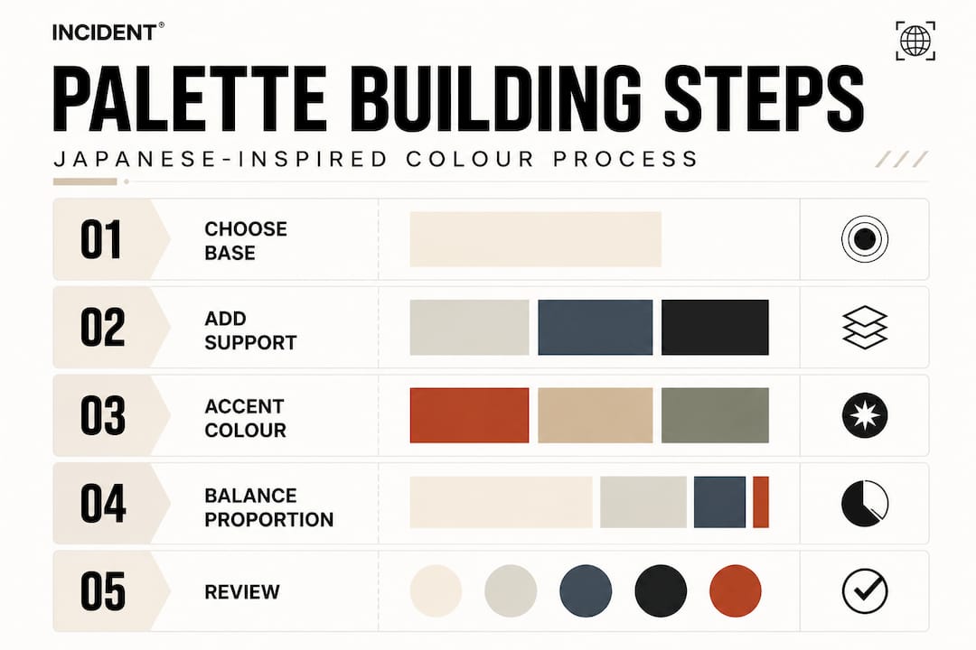
Notice that even the “accent” here is muted. This is not a space for neon or pattern. The accent’s job is to provide just enough contrast to stop the look from disappearing entirely.
Step-by-step palette construction:
- Start with your dominant shade. Choose one neutral from the off-white, greige, or charcoal family. This will be the colour most visible on your body.
- Select a supporting shade. It should be in the same tonal family but shifted slightly in value. A warm cream base works beautifully with a cool taupe support, for instance.
- Pick your accent. Look for a muted earth tone or a faded botanical shade. The accent should feel like it was always going to be there, not like an afterthought.
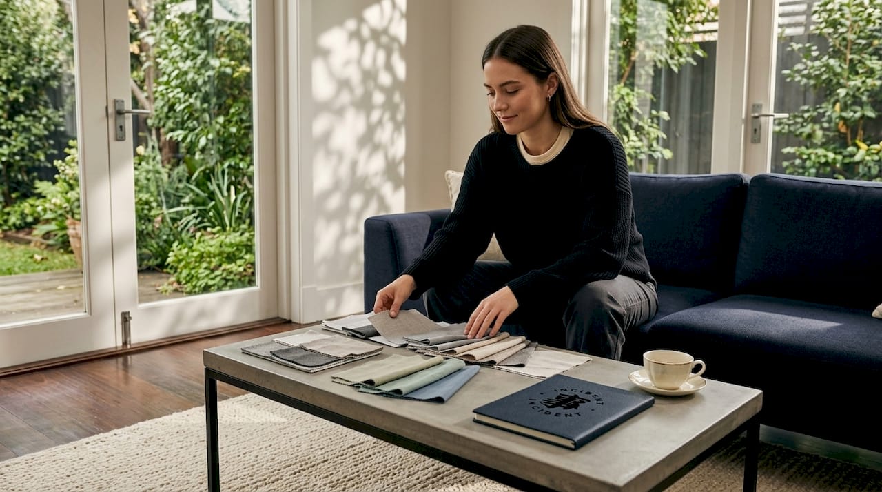
- Lay everything together physically. Whether that means placing garments on a flat surface or using a mood board app, always test combinations before committing.
- Assess under different light. Artificial light flattens subtlety. Take your combination outdoors or near a window to confirm that the layers still read as intentional.
Pro Tip: When in doubt about your accent, halve the amount you planned to use. Japanese-inspired palettes almost always benefit from less, not more.
For guidance on building a wardrobe around these palette mechanics, the timeless wardrobe building guide offers a complementary perspective on how to invest in pieces that coordinate naturally across seasons.
How to style and layer Japanese-inspired colour palettes
Now you know the theory; here is how to confidently assemble full looks and experiment for your individual style. Styling is where the mechanics become personal. Two people can follow the same palette rules and produce distinctly different results based on proportion, texture, and layering order.
Step-by-step styling process:
- Build from the base layer outward. Your base layer, usually a tee or fitted long-sleeve, sets the dominant colour and tone. Choose it deliberately.
- Add a mid-layer that shifts value. A slightly darker overshirt or slightly lighter hoodie placed over the base creates the layered depth that characterises Japanese minimalism. The key word here is slightly: a dramatic shift in value disrupts the harmony.
- Introduce your accent last and selectively. A cap, a bag, footwear, or a single accessory in the accent colour is enough. The accent should arrive as a quiet statement rather than a loud announcement.
- Assess the silhouette as a whole. Japanese minimalism often favours relaxed, generous cuts. The colour palette and the silhouette work together. Wearing fitted pieces in these palettes can shift the register from minimal to clinical.
- Introduce texture to prevent flatness. A cotton canvas overshirt over a jersey tee introduces textural contrast even when both are the same or very similar in colour. This is precisely how Japanese minimalist fashion achieves its layered, coordinated look across a small set of base colours.
Common mistakes to avoid:
- Using your accent colour in more than one garment. If your terracotta appears on your cap, your bag, and your socks, it stops being an accent and becomes a third dominant, which is visual noise.
- Choosing textures that are too similar. Two matte fabrics in similar tones can make a layered look appear flat. Pairing a woven with a jersey or a brushed cotton with a smooth linen adds dimension without changing colour at all.
- Skipping natural light assessment. This is the most common error. Colours behave differently under fluorescent shop lighting than they do in daylight. Always confirm your palette outdoors before committing to a look.
- Over-curating to the point of stiffness. Real-world Japanese minimalism has room for personality. A worn-in tote, a faded cap, or a slightly oversized silhouette adds the human quality that keeps looks from feeling like a catalogue image.
Pro Tip: Collect a small swatch or photo of your dominant and supporting shades on your phone. When shopping for an accent, you can immediately test the combination in-store rather than guessing from memory.
For specific styling inspiration suited to the urban environment, explore urban layering tips and the menswear essentials guide.
Common mistakes and how to verify your colour palette
Even experienced dressers make mistakes. Here is how you can sidestep common pitfalls and make sure your results truly stand out.
The most frequently encountered issue in Japanese-inspired dressing is not too much colour. It is too little depth. Going heavily neutral without building layered tonal interest creates what might be described as a “greige blob” effect: technically correct, but visually inert. Wabi-sabi-oriented guidance specifically warns against single-tone beige or cream looks, steering instead toward desaturated depth achieved through layered values and textures that interact with natural light.
Here is a checklist for verifying your palette before you leave the house or finalise a wardrobe purchase:
- Do your base and supporting shades sit comfortably together without competing? They should feel like related chapters, not separate stories.
- Does the accent read as deliberate, not accidental? If someone could mistake your accent for an unintentional mismatch, it is either in the wrong shade or in too large a quantity.
- Is there textural variation between your layers? Tactile contrast is often what separates a well-constructed look from a flat one.
- Does the outfit hold together under natural light? Revisit this at different times of day if you are unsure.
- Could you swap one garment for another in a similar shade and still have the palette work? This is the test of whether you have built a system or just assembled one specific outfit.
“Light and texture are the invisible architects of every great palette. Without them, even the most carefully chosen shades collapse into a single, forgettable note.”
The goal is not to achieve perfection on the first attempt. Japanese minimalism, at its philosophical core, values iteration and refinement over instant resolution. Adjust as you go. Pay attention to what works and what doesn’t over time. Personal expression is, in fact, woven into the tradition you are drawing from. Explore ideas around expressing individuality within a minimalist framework for more on this important distinction.
Why mastering colour nuance is the secret to standout style
Here is an opinion that might challenge how you have been approaching this: the best-dressed people in Japanese-inspired streetwear are not the ones who followed the formula most precisely. They are the ones who understood the formula well enough to adjust it thoughtfully.
There is a persistent belief that if you simply copy the right colour chart or source the correct shades, the style will follow automatically. It will not. Style is not a mathematical output. Sanzo Wada’s combinations are a foundation, not a destination. The designers and individuals who return to them season after season do so because they use them as a starting point from which to experiment, not as a fixed instruction.
What separates a genuinely striking minimalist look from a forgettable one is almost always in the nuances: the weight of a fabric, the way a particular shade shifts from morning to afternoon light, the quiet tension between two near-identical values that creates depth without drama. These are things no colour chart can hand you. They develop through close observation and a willingness to try things that might not work.
We find it important to say clearly: minimalism is not monotony. This is perhaps the most common misreading of Japanese aesthetic tradition. Minimalism is careful selection. It is the discipline of choosing exactly what earns its place and nothing more. Within that discipline, there is enormous room for personality, heritage references, and individual expression. The fact that your palette runs from cream to charcoal does not mean your look has to feel anonymous. The silhouette, the fit, the texture, and yes, the precise accent you choose — these are the details that make a look yours.
If you are ready to push further, our styling tips for special occasions offer a considered look at how these palette principles translate into more intentional dressing moments. A hanami gathering, a gallery opening, a considered evening out: these are the moments where colour nuance truly earns its keep.
The lesson we keep returning to is this: learn the rules with rigour, then trust your instincts to know when a small deviation will make the whole thing sing. That instinct is not something you are born with. It is built through careful practice, honest assessment, and genuine curiosity about what Japanese aesthetics actually values — not just what it looks like on a screen.
Elevate your style with curated Japanese-inspired streetwear
Ready to elevate your look with palettes that work? Here is where to make these ideas real.
Understanding the principles of Japanese-inspired colour palettes is only half the work. The other half is having the right garments to build from. Pieces that are cut generously, made from quality fabrics, and offered in the precise shades these palettes demand.

Our premium Pima T-shirt collection is designed with exactly this in mind. Each piece is crafted from ultra-soft Pima cotton and offered in a considered range of tones that translate directly into the dominant and supporting roles described in this guide. The shades are not trend-driven. They are selected to coordinate effortlessly across seasons and to hold their depth wash after wash. If you are building a wardrobe around the palette mechanics outlined here, these are the foundational pieces worth starting with. Browse all Japanese-inspired pieces at incident.store and find the garments that will bring your palette to life.
Frequently asked questions
What are the most authentic Japanese-inspired neutral shades?
Off-white, greige, taupe, charcoal, and muted navy are the most widely used neutral bases in Japanese-inspired palettes, as authentic Japandi palettes consistently show across both fashion and interior design.
How do I pick a Japanese accent colour without clashing?
Choose a muted earth-tone accent that is slightly darker or lighter than your base and use it in small amounts to maintain harmony, since Japanese minimalist dressing relies on at most one muted accent to keep the wardrobe cohesive.
What is Sanzo Wada’s ‘Dictionary of Color Combinations’ and why is it relevant?
It is a catalogue of 348 proven colour pairings from early twentieth-century Japan, still referenced by designers as a reliable, empirically grounded palette resource that has never gone out of fashion.
Can I use bold colours and still keep a Japanese-inspired look?
You can, but bold shades should appear only as very small accents in minimal quantities; overuse of bright colour disrupts the restrained, considered vibe that defines Japanese aesthetic sensibility.
What makes a Japanese palette look ‘authentic’ rather than cliché?
Layering tonal values, using natural light, and choosing subtler accent shades maintain a refined, genuine effect, as wabi-sabi colour principles specifically recommend avoiding harsh contrasts in favour of gentle, textured transitions.


Share:
Urban fashion essentials: Minimalist Japanese streetwear for city life
Cross-cultural fashion: Blending Japanese and global streetwear