
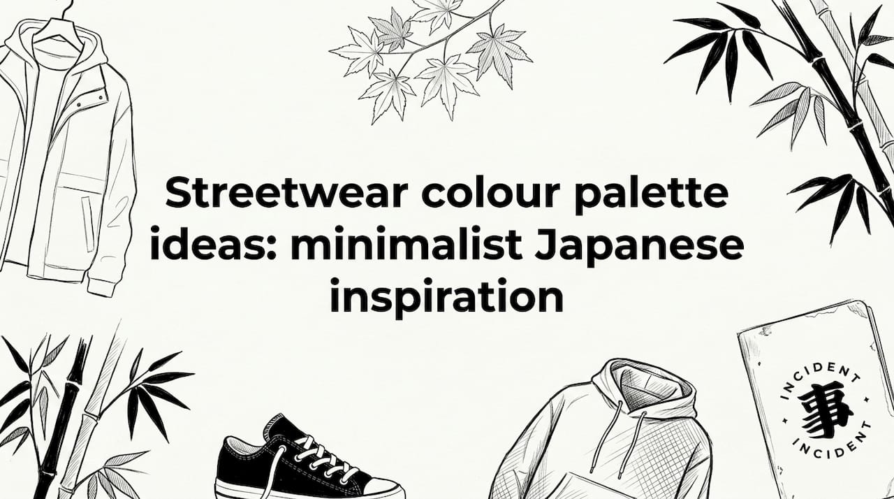
TL;DR:
- Building a cohesive streetwear wardrobe relies on a neutral core, accent shades, and thoughtful layering to reflect seasonal and personal trends.
- Minimalist, Japanese-inspired palettes emphasize quality, texture, and restraint, showcasing details over boldness for lasting style.
Curating a streetwear wardrobe that feels both genuinely fresh and quietly timeless is harder than it looks. Too many options, too many trends pulling in opposite directions, and suddenly you’re standing in front of a rail of clothes that don’t quite speak to each other. At INCIDENT, we believe the most compelling street style emerges from intention, not impulse. Drawing on Japanese minimalist principles and reading 2026’s most compelling colour signals, this guide walks you through exactly how to build, layer, and personalise a palette that carries real presence on any European street.
Table of Contents
- How to build a modern streetwear palette: criteria that matter
- Foundations: essential neutral palettes in Japanese streetwear
- Accent colours: 2026 streetwear trends for impactful highlights
- Fusion palettes: European twists on Japanese minimalism
- Perspective: why less is more — finding personal flair in minimalist palettes
- Shop the look: minimalist streetwear essentials
- Frequently asked questions
Key Takeaways
| Point | Details |
|---|---|
| Master the 80/20 rule | Basing 80% of your look on neutrals and 20% on accents creates balance and cohesion. |
| Prioritise Japanese neutrals | Black, white, grey, and beige provide a timeless and flexible base for any modern wardrobe. |
| Add trending accents | Incorporate butter yellow, navy, and earthy tones for an on-trend look in 2026. |
| Blend styles for impact | Fuse Japanese minimalism with subtle pastels or bold colour-blocking for a look that’s both unique and wearable. |
How to build a modern streetwear palette: criteria that matter
Before you start pulling pieces together, it helps to understand what separates a considered palette from a random collection of garments. The goal isn’t simply to pick colours you like. It’s to construct a visual language that works across seasons, occasions, and layering combinations.
The most reliable starting point is proportion. Following 80% neutrals and 20% bold accents creates a foundation that is both versatile and visually cohesive. This ratio has been validated across fashion collections repeatedly, and it works precisely because it removes the guesswork from getting dressed. Your neutrals carry the weight; your accents do the talking.
Within that framework, you then choose between two core harmony strategies: monochrome or strategic contrast. Monochromatic dressing, for example, stacking multiple shades of grey or layering different tones of beige, reads as effortlessly sophisticated. Strategic contrast, such as placing a butter yellow accent against a charcoal base, creates energy without chaos. Both approaches sit comfortably within Japanese streetwear aesthetics, where restraint is a strength rather than a limitation.
Seasonal interest matters too. Incorporating pastels in spring and summer, or earthy tones in autumn and winter, keeps your palette feeling alive and relevant without requiring a full wardrobe overhaul. Think of it as rotating a small number of accent shades across a fixed neutral core.
Function should never be an afterthought. When building a minimalist palette, consider how each piece layers with others: does your navy accent hoodie work over both your white base tee and your beige long-sleeve? If yes, it earns its place. If it only pairs with one item, it’s an inefficient choice for a curated wardrobe. Our timeless wardrobe guide covers this layering logic in depth, and it’s an excellent companion to the ideas here.
For a structured approach to the broader trends shaping your choices this year, the streetwear trends 2026 resource maps out the key directions with real clarity.
- Define your neutral core first (black, white, grey, beige, or a combination).
- Choose one or two accent shades that reflect the current season.
- Select a harmony strategy: monochrome or contrast.
- Test every new piece against your existing core before purchasing.
- Reassess your accent colours each season, but keep the neutral foundation steady.
Pro Tip: Before you shop anything, build a digital mood board using a free tool like Coolors or Adobe Colour. Drag in swatches of what you already own alongside potential new purchases. Seeing the palette visually before committing to it saves both money and frustration.
Foundations: essential neutral palettes in Japanese streetwear
With criteria established, let’s explore the neutral colour foundations that underpin the look. Japanese minimalist aesthetics have always leaned on a quiet, considered palette. The colours themselves aren’t the statement. The way they’re worn, layered, and textured is where the craft lives.
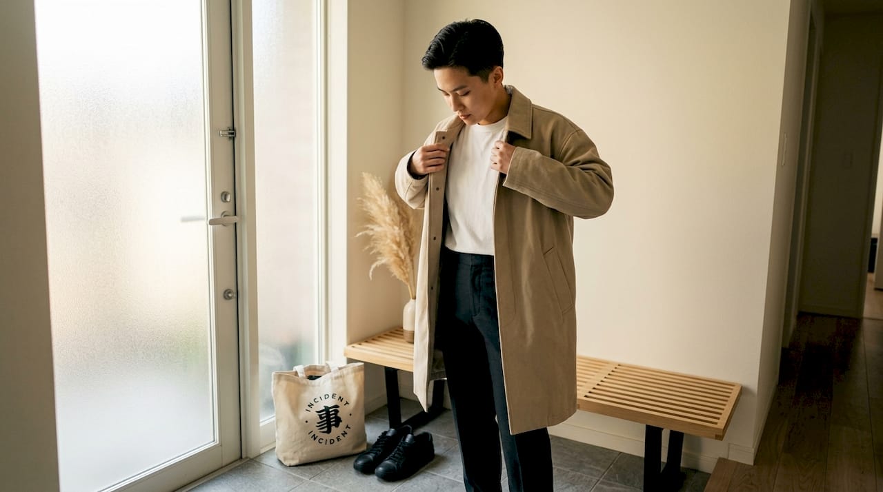
The four pillars of Japanese neutral style are black, white, grey, and beige. Each one brings something distinct to the wardrobe. Black offers structure and depth. White creates lightness and clarity. Grey sits between them as the great mediator, adaptable and endlessly wearable. Beige, particularly in warmer, slightly sandy undertones, adds an organic warmth that reads as refined rather than bland.
Uniqlo’s LifeWear philosophy exemplifies this perfectly, championing neutral palettes with functional layering and emphasising timeless neutrals for everyday minimalism. It’s a design language that speaks to longevity, where a piece bought today should still feel right three years from now.
For autumn and winter dressing specifically, earthy undertones transform the standard neutral palette into something richer. Warm off-whites, stone, taupe, and dusty mushroom all sit within the neutral family but carry a seasonal warmth that pure white or cool grey cannot replicate. Layering these across different fabric weights creates visual texture without introducing any new colour at all. That’s the quiet power of working within a restrained palette.
Fabric choice is inseparable from colour in this context. Our Japanese fabrics guide explains how materials like pima cotton and linen hold and reflect colour differently, and why that matters when you’re building a palette that relies on subtlety rather than saturation. A beige rendered in heavyweight cotton has an entirely different presence to the same beige in a fine linen weave.
For a visual exploration of how these neutrals come alive in actual outfits, the Japanese minimalism lookbook is worth spending time with.
Neutrals are not the absence of style. They are the most deliberate style choice you can make. When every element of an outfit is considered, the palette becomes the statement.
What to pair with each neutral:
- Black: pairs effortlessly with white, slate grey, and deep navy; avoid pairing with dark brown, which creates a muddy visual clash
- White: works with everything, but is most striking against warm beige or a clean navy; avoid pure white with cream, which creates an unintentional mismatch
- Grey: layer tonal greys confidently; introduce a single warm beige or soft sage for contrast
- Beige: pairs beautifully with warm off-white, camel, and olive; avoid cool blues or stark blacks, which flatten its warmth
Accent colours: 2026 streetwear trends for impactful highlights
Now that the foundation is set, explore the accent shades that freshen minimalism in 2026. Choosing the right accent colour is where your palette becomes distinctly yours. It’s a small decision with a disproportionate impact on the overall look.
For spring and summer 2026, the standout accent shades are butter yellow and navy. Both offer very different energies. Butter yellow is warm, optimistic, and surprisingly versatile against neutral bases; it lifts a monochrome grey outfit without overwhelming it. Navy is quieter and more considered, blurring the line between neutral and accent depending on how it’s used. In a single pocket detail or a cap, navy reads as refined. As a full outer layer, it shifts the palette meaningfully.
For autumn and winter, earthy greens, warm browns, and terracotta carry the accent role with confidence. These shades feel grounded and seasonal, connecting the wardrobe to the natural world in a way that resonates with Japanese design philosophy, where nature is always close to the surface of creative thinking.
The key to introducing colour without losing the minimalist feel is restraint in placement. One accent item per outfit is usually the rule. That might be a graphic tee with a single-colour print, a bag in butter yellow, or navy trainers against a white and grey outfit. The accent should punctuate, not dominate.
Pro Tip: If you’re uncertain about committing to an accent colour in a full garment, start with accessories. A cap, a tote, or a pair of socks in your chosen accent shade lets you test the colour in your actual rotation before investing in larger pieces. It’s a low-risk way to explore hanami styling tips and seasonal colour.
| Season | Trending accent colour | Best neutral base | Effect |
|---|---|---|---|
| SS26 | Butter yellow | Chalk white or light grey | Warm, energetic, optimistic |
| SS26 | Navy | Off-white, beige, stone | Refined, grounded, classic |
| FW26 | Terracotta | Taupe, warm grey, oatmeal | Earthy, rich, seasonal |
| FW26 | Earthy green | Black, sand, deep beige | Natural, understated, strong |
| FW26 | Warm brown | Off-white, charcoal | Heritage, craft, depth |
These pairings work because they respect the proportional logic established earlier. The accent is always in conversation with the neutral, never competing with it. A minimalist graphic tee in a clean white with a subtle butter yellow graphic is a perfect example of this balance in practice: the colour is present, but the design does not shout.
What to consider when selecting your accent shade:
- Does it sit harmoniously with at least three neutral pieces you already own?
- Is it available in both your spring/summer and autumn/winter wardrobes, or is it purely seasonal?
- Does it reflect your personal character, not just what’s trending on feeds?
- Can it work in both an oversized and a fitted garment silhouette?
Fusion palettes: European twists on Japanese minimalism
Having explored accents, examine how to fuse these elements for innovative, personal palettes. The most interesting streetwear happening in Europe right now sits at the intersection of Japanese restraint and continental sensibility. It doesn’t borrow wholesale from either tradition. It takes what’s most useful from both and creates something genuinely new.
Traditional Japanese streetwear is deeply committed to neutrals. Global 2026 trends, particularly what GQ has highlighted around primary colour blocking, push in a bolder direction with saturated primaries and strong contrast. For a European audience that values both quiet sophistication and expressive individuality, the sweet spot is a hybrid approach: a neutral Japanese base enriched with soft pastels or a single considered accent from the European palette.
Think sage green. It carries the organic quality of Japanese earth tones but reads with the lightness of a European pastel. Blush pink, when worn in a relaxed oversized silhouette, feels grounded rather than delicate. Dusty lilac over an oatmeal base is quietly arresting without ever feeling loud. These are the fusion palettes that photograph beautifully and wear even better in the real world.
Our versatile minimalism guide explores how to build these kinds of outfits piece by piece, and it’s a practical companion to the palette ideas below.
Step-by-step guide to creating your own fusion look:
- Start with your neutral base: choose one of the four pillars (black, white, grey, or beige) as the dominant colour in your outfit.
- Add a second neutral in a different weight or texture. For example, a white heavyweight tee under a light grey linen shirt.
- Introduce your fusion accent: select a muted pastel or a soft European-influenced hue that shares an undertone with your neutrals. Sage over beige, blush over white, dusty blue over grey.
- Keep accessories within the neutral family. Let the palette speak; don’t add more competing tones.
- Photograph the combination before wearing it. The camera is a reliable editor, revealing clashes that aren’t always obvious in the mirror.
| Fusion palette | Base neutral | Accent | Season | Mood |
|---|---|---|---|---|
| Sand and sage | Warm beige | Dusty sage green | SS and FW | Calm, earthy, contemporary |
| Chalk and blush | Off-white | Soft blush pink | SS | Light, refined, personal |
| Charcoal and butter | Dark grey | Butter yellow | SS | Bold contrast, urban energy |
| Oatmeal and lilac | Oatmeal | Dusty lilac | SS | Inventive, quiet, artistic |
| Stone and terracotta | Stone grey | Terracotta | FW | Grounded, warm, seasonal |
| Black and sage | Black | Sage green | FW | Striking, minimal, strong |
Each palette above represents a real outfit framework, not just an abstract colour exercise. Try building an outfit around the sand and sage combination: sand-coloured wide-leg trousers, a white base tee, and a sage green overshirt or lightweight jacket. The result is three-dimensional, textured, and unmistakably considered.
Perspective: why less is more — finding personal flair in minimalist palettes
With plenty of palette inspiration on the table, consider why minimalist colour mastery stands out in today’s crowded scene. There is a tendency in contemporary streetwear to equate boldness with confidence. More colour, more contrast, more visual noise. But we’d argue the opposite. The most self-assured dressers we encounter, across European cities from Zürich to Stockholm to Amsterdam, are almost always wearing very little colour. And they’re the ones you notice.
The reasons are worth thinking through. When you limit your palette, every detail becomes visible. The quality of a seam. The weight of a fabric. The precision of a cut. These are the things that distinguish genuinely crafted clothing from its fast-fashion counterpart. A highly colourful outfit, however well-intentioned, can obscure these details. A restrained palette puts them on display.
Too many streetwear dressers today chase boldness without intent. They follow trends because they feel the pressure to stay visible in a very loud visual culture. But trend-hopping without a clear colour identity produces wardrobes that feel incoherent over time. You end up with pieces that don’t communicate with each other, and getting dressed becomes a chore rather than a creative act.
The brands and creatives who consistently make the strongest impression are those who’ve identified a signature language. That might be a commitment to a specific range of warm neutrals. It might be a single recurring accent, perhaps a deep forest green or a warm rust, that appears across multiple seasons as a recognisable thread. This kind of consistency builds a visual identity that goes beyond any single outfit.
Our view is that expressing individuality through minimalist Japanese streetwear isn’t a contradiction. It’s actually the most effective form of self-expression available through clothing. When you master the neutrals and develop one signature accent, you stop dressing reactively. You start dressing with genuine authority.
The practical advice is simple. Spend less time asking which colours are trending, and more time asking which single accent colour genuinely reflects who you are. Then build everything else around your neutral core, and let the restraint do the work. The people who stop you on the street to ask where you got your outfit? They’re almost never asking about the loudest piece. They’re asking about the quiet one.
Shop the look: minimalist streetwear essentials
Inspired by these palette ideas, discover essentials that make building your look straightforward and rewarding.

At INCIDENT, every piece we design is conceived as a palette-ready foundation. Our fabrics are chosen for how they carry colour, and our silhouettes are crafted to layer cleanly across seasons. Whether you’re building around a chalk-white neutral base or experimenting with a terracotta accent for FW26, you’ll find exactly what you need in our collections.
Explore our pima T-shirt collection, where premium pima cotton tees in core neutrals and seasonal accents offer the kind of versatile foundation every minimalist wardrobe demands. Soft to the touch, precise in construction, and available in shades that speak directly to the palettes covered in this guide.
For the full picture, visit the INCIDENT store to browse our current range of Japanese-inspired streetwear essentials, all designed with the Japandi philosophy of purposeful simplicity at their core.
Frequently asked questions
What is the best neutral base for streetwear in 2026?
Classic neutrals like black, white, and beige remain the best base for streetwear in 2026, as confirmed by Uniqlo’s LifeWear approach, which champions these timeless shades for their everyday versatility and longevity across trends.
How do I add bold colour to a minimalist streetwear outfit?
Follow the 80% neutral and 20% accent colour rule: select one bold shade for a single accessory or key garment, keeping every other element of the outfit within your neutral core.
Which accent colours are trending in streetwear for 2026?
Butter yellow and navy are the standout accent choices for SS26, while earthy tones persist for FW, with terracotta, warm brown, and earthy green all carrying strong seasonal relevance.
How can I make my palette unique while following current trends?
Personalise by committing to one or two signature accent shades across multiple seasons, or blend Japanese neutrals with subtle European pastels. Hybrid approaches that combine a Japanese neutral base with soft, muted pastels offer genuine individuality without losing cohesion.


Share:
Mindful fashion explained: minimalism, sustainability and streetwear
Incident Style Identity Template