
TL;DR:
- Mastering Japanese print styling involves understanding motifs, symbolism, and design philosophies like shibui and streetwear maximalism.
- Use a hero print as the outfit’s focal point, balancing it with neutral base pieces and controlled layering.
- Less is more; restrained outfits with thoughtful space and quality basics create stronger, more confident looks.
There is a particular frustration that comes with standing in front of your mirror, wearing what should be a striking Japanese-inspired outfit, only to find the pieces fighting each other instead of working in harmony. The prints feel too loud, the colours jar, and the whole effect is somehow both too much and not enough. It is a common experience, and it is entirely solvable. Mastering Japanese print coordination is not about memorising rigid rules. It is about understanding a visual language rooted in centuries of thoughtful craft, and applying that understanding with confidence and intentionality. This guide gives you exactly that.
Table of Contents
- Understanding Japanese prints: Key motifs and style philosophies
- Prepping your wardrobe: Choosing base layers and essentials
- Step-by-step: How to match Japanese prints for optimal effect
- Troubleshooting and common mistakes: What to avoid
- Verifying the look: Final checks and styling tweaks
- Our take: Why minimalism matters more than ever when mixing Japanese prints
- Shop refined Japanese print streetwear
- Frequently asked questions
Key Takeaways
| Point | Details |
|---|---|
| Know your motifs | Familiarity with core Japanese prints ensures meaningful and stylish combinations. |
| Start simple | Building around neutral basics keeps outfits cohesive when adding bold prints. |
| Mix with intent | Deliberately vary print size and colour for a look that’s balanced, not busy. |
| Check before you go | Always step back and review your outfit for harmony and confidence. |
Understanding Japanese prints: Key motifs and style philosophies
Before you start mixing prints, it is essential to recognise the key themes that define Japanese graphic style. Japanese prints are not decorative at random. Each motif carries weight, history, and meaning, and understanding that foundation is what separates a considered outfit from a confused one.
The most iconic motifs you will encounter include:
- Koi fish: Symbols of perseverance, good fortune, and transformation. Bold, flowing in form, and often rendered in vivid oranges, reds, and golds against dark or white grounds.
- Sakura (cherry blossoms): Representing the beauty of impermanence, they appear in pale pinks, deep magentas, and soft whites. Graceful and versatile across both understated and striking garments.
- Waves (Nami): Inspired by Hokusai’s iconic imagery, wave patterns convey strength and natural force. They work beautifully as background prints or as a hero motif on larger garments.
- Cranes (Tsuru): Associated with longevity, elegance, and good luck, cranes tend to appear in high-contrast settings and pair exceptionally well with minimalist silhouettes.
Understanding Japanese symbolism in clothing gives you an immediate advantage when selecting pieces, because you can choose motifs that feel personally meaningful rather than simply decorative.
Two major design philosophies shape how these motifs are used in contemporary fashion. The first is shibui, a Japanese aesthetic principle valuing quiet, restrained beauty. Think subtle tonal prints, understated colour palettes, and garments where the print enhances rather than dominates. The second is the maximalist influence of Japanese street culture, where bold graphics, oversized imagery, and neon accents create energy and visual drama. Neither approach is superior. The most compelling outfits often borrow from both.
| Philosophy | Visual character | Best suited to |
|---|---|---|
| Shibui (restrained) | Tonal, subtle, precise | Minimalist layering, quiet luxury |
| Streetwear maximalism | Bold, graphic, high contrast | Statement outfits, expressive styling |
| Japandi fusion | Clean lines, muted with one accent | Contemporary everyday wear |
Colour palettes in Japanese print traditions tend to fall into two camps. The classic palette uses restrained indigos, off-whites, stone, and charcoal, punctuated by a single accent of red or deep gold. The contemporary streetwear palette borrows those foundations and adds pops of neon green, electric blue, or pastel pink. Understanding which palette your pieces belong to is the first step in knowing whether they will complement or conflict with each other. Explore the broader world of Japanese-inspired prints to deepen your visual vocabulary before building your wardrobe.
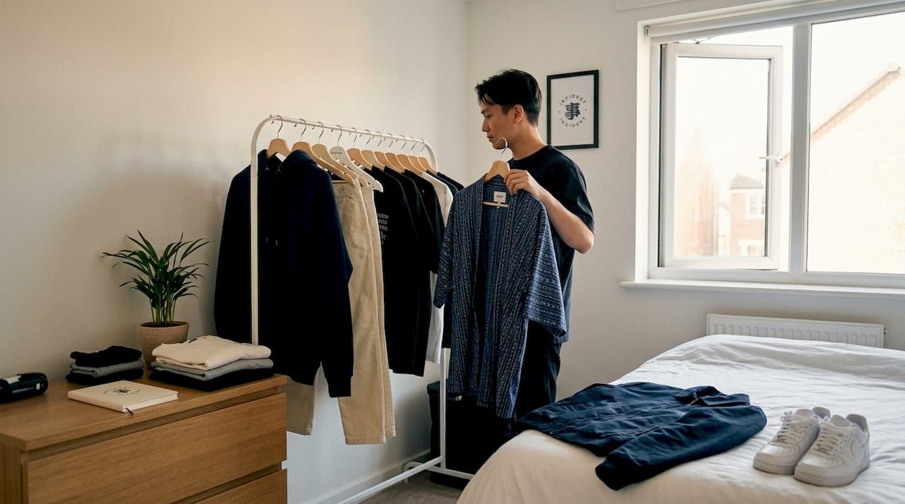
Prepping your wardrobe: Choosing base layers and essentials
Now that you recognise key themes, let us prepare the right base to ensure prints shine without overwhelming your look. Think of your foundational pieces as the negative space in a piece of Japanese calligraphy. They are not empty. They are purposeful, and they give the printed elements room to breathe.
The most reliable base pieces include:
- Crisp white tees: A premium white tee in a clean, relaxed fit is perhaps the single most versatile foundation in a Japanese streetwear wardrobe. It allows even complex prints to take centre stage.
- Dark indigo or black denim: Straight-leg or slightly tapered fits work best. Avoid heavily distressed styles, which compete visually with graphic prints.
- Tailored joggers in stone, grey, or charcoal: These offer a contemporary silhouette that complements the clean lines favoured in Japanese aesthetics.
- Monochrome hoodies and track tops: Solid-colour layering pieces that help you build dimension without adding visual noise.
The quality of your base layers matters far more than most people realise. Premium minimalist streetwear fabrics, such as Pima cotton, Japanese selvedge denim, and woven technical blends, hold their structure and drape in ways that elevate even a simple outfit. A beautiful koi-print tee worn over a cheap, shapeless pair of trousers looks accidental. Worn over well-cut dark joggers in a quality fabric, it looks considered.
Balancing texture and silhouette is another layer of preparation that most guides skip. Japanese aesthetics frequently play with contrast between structure and fluidity. A rigid, crisp shirt paired with softly draped trousers creates an interesting tension. Similarly, a voluminous printed piece works best when anchored by a slim or streamlined bottom.
| Base piece | Works with | Avoid pairing with |
|---|---|---|
| White Pima tee | All print types | Heavy textures like cable knit |
| Dark indigo denim | Bold and tonal prints | Overly distressed finishes |
| Stone tailored jogger | Graphic and wave prints | Maximally patterned outerwear |
| Charcoal hoodie | Subtle crane or sakura prints | Neon or oversaturated prints |
Pro Tip: When in doubt, anchor your outfit in monochrome. A single bold print against an entirely neutral outfit always reads as intentional. Pair the rest of your outfit using pieces from the streetwear lookbook for visual reference when you are building new combinations.
Step-by-step: How to match Japanese prints for optimal effect
Armed with wardrobe basics, let us move into the actual steps to combine Japanese prints seamlessly. This is a repeatable framework. Once you internalise it, you will find that putting together a cohesive Japanese-inspired outfit becomes second nature.
1. Choose your hero print first. Every great outfit built around Japanese prints starts with a single dominant piece. This might be a large-scale wave graphic on an oversized tee, an embroidered crane on a bomber jacket, or an all-over sakura pattern on wide-leg trousers. Whatever it is, it forms the centrepiece. Every other decision you make flows from this one.
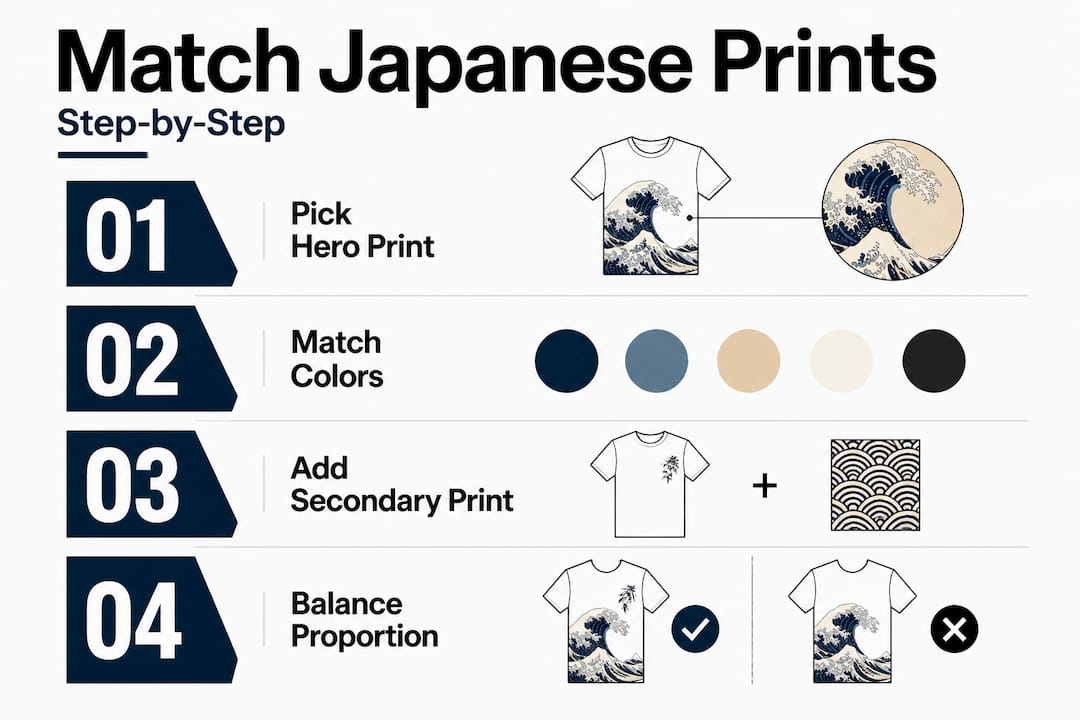
2. Identify the dominant colour within the hero print. Pull one or two of those colours into your secondary pieces. If your koi-print tee uses terracotta and indigo, your trousers and outerwear should echo those tones rather than introduce entirely new ones.
3. Introduce a secondary print, if any, at a reduced scale. A hero print with large, expressive motifs pairs naturally with a secondary print featuring smaller, more repetitive geometry. Think small diamond weaves, fine stripes, or a subtle tonal texture. The contrast in scale prevents the two prints from competing. Streetwear styling elements can guide you on how to layer these elements in everyday outfits without losing coherence.
4. Observe the 70/30 rule. Keep your hero print occupying roughly seventy per cent of your visible surface area, with neutral or lightly textured pieces filling the rest. This creates hierarchy and prevents visual chaos.
5. Add solid outerwear to control the composition. An open overshirt, structured coach jacket, or clean bomber in a neutral tone does something remarkable. It frames the prints beneath it, creating a visual boundary that makes the overall outfit feel curated rather than cluttered. This is particularly useful when transitioning across seasonal streetwear from summer layering to autumn builds.
6. Address footwear last. Footwear should not introduce a new colour story. Clean white trainers, black leather sneakers, or simple canvas shoes in neutral tones keep the focus on the garments. Avoid loud or heavily branded footwear that pulls attention away from the prints.
If you are new to print coordination, wear no more than two prints per outfit. One hero and one subtle secondary. Once that feels natural, you can begin experimenting with greater complexity.
Pro Tip: Solid outerwear worn open over a printed layer is one of the most effective techniques in Japanese streetwear styling. It signals layering without crowding the composition, and gives you the flexibility to adjust your look throughout the day simply by closing or removing the outer layer.
Troubleshooting and common mistakes: What to avoid
Even the best-planned outfits can fall victim to common errors. Here is how to sidestep them with ease, and how to correct them when they occur.
Over-matching colours looks forced, not considered. There is a difference between harmonious colour and matchy-matchy colour. If every piece in your outfit uses exactly the same shade of red, the look becomes flat. Introduce slight tonal variation. A deep burgundy, a bright cherry, and a faded rose can coexist beautifully within the same palette.
Mixing motifs with clashing symbolism undermines your look. This is more subtle, but experienced eyes will notice. Koi fish are dynamic, assertive, and bold. Cranes are serene, precise, and elegant. Wearing both in equal measure can feel conceptually dissonant. It is not a hard rule, but pairing motifs that share a mood or energy creates a more cohesive result. Read up on Japanese style with denim to see how to anchor contrasting motifs with consistent base pieces.
Ignoring fabric weight and seasonality creates awkward combinations. A lightweight cotton sakura-print shirt worn under a heavy fleece in summer, or a thin wave-print tee paired with tailored wool trousers in winter, creates a mismatch that you can feel as much as see. Match fabric weight across the outfit for a result that looks and feels intentional.
Oversized accessories overshadow the prints. Statement chains, oversized logos, and large embellishments all compete for attention. When you are wearing Japanese prints, the print is the jewellery. Keep accessories restrained: a simple bracelet, minimal earrings, or a clean cap in a neutral tone.
Here are the most common mistakes to keep in mind:
- Wearing prints in clashing colour families (warm and cool tones without a bridge)
- Choosing two hero prints of identical scale
- Neglecting the fit of foundational pieces, which undermines the prints above them
- Adding patterned socks, scarves, and bags to an already-printed outfit
- Selecting prints that have no shared colour, tone, or mood
Many stylists recommend that statement prints occupy no more than thirty per cent of your total ensemble when combining more than one print, allowing the negative space and neutral elements to carry the composition forward. This thirty per cent principle is particularly useful as a starting point for those who find print mixing intimidating, because it reframes the question. Instead of asking “how much print can I wear?”, you ask “how much quiet does this outfit need?”
Verifying the look: Final checks and styling tweaks
After you have assembled your look, there is one more step: ensuring your efforts pay off with a final inspection of the whole ensemble. This is the part of the process that separates good outfits from great ones, and it takes less than two minutes.
Step 1: Check for visual balance. Stand back and look at your outfit in a full-length mirror. Does your eye travel naturally around the outfit, or does it get stuck in one area? A balanced look guides the eye with intention. If one section feels too heavy or too busy, swap or remove one element.
Step 2: Assess motif harmony. Ask yourself whether the prints in your outfit share something. A colour, a mood, a cultural reference, or a scale relationship. If the answer is no, consider whether one of the printed pieces can be replaced with a solid alternative.
Step 3: Check your confidence. This might sound unexpected, but it is genuinely the most important step. If you feel uncertain or uncomfortable in the outfit, the look will not land regardless of how technically correct it is. The Japanese minimalism lookbook is a helpful reference for seeing how real outfits translate the principles above into wearable, confident looks.
Quick fixes when something feels off:
- Swap a patterned accessory for a neutral one
- Close the overshirt or jacket to frame and simplify the visible print
- Reconsider footwear if it is pulling focus
- Replace a secondary print with a solid piece in the same colour
| Intentional coordination | Accidental mishmash |
|---|---|
| Shared colour family across all pieces | Competing, unrelated colour stories |
| Varied print scales (large and small) | Two or more prints of identical scale |
| One clear hero print | Multiple prints competing for attention |
| Neutral base anchoring the composition | Patterned base adding visual noise |
| Purposeful accessories | Accessories that introduce new motifs |
The rules above are guidelines, not restrictions. Japanese graphic tee styles, for instance, often break conventional pairing logic entirely, layering bold graphics over equally expressive bases, yet the result works because of a shared energy and cultural coherence. Explore Japanese graphic tee approaches to see how that boundary-pushing confidence is expressed in practice.
Our take: Why minimalism matters more than ever when mixing Japanese prints
Having checked your work, take a moment to reflect on the philosophy behind print mixing in Japanese fashion. And here is where we want to offer a perspective that runs counter to a lot of what you will see on social media.
The loudest outfits are rarely the most powerful. There is a growing cultural pressure in streetwear to layer more, add more, and express more through sheer volume of visual information. But Japanese design traditions have understood for centuries that restraint is not a limitation. It is a form of strength.
When you wear a single, beautifully chosen Japanese print against a clean, considered base, you are doing something that maximalist layering cannot achieve. You are creating space for the motif to speak. A crane on a white Pima tee, worn with slim indigo denim and nothing else competing for attention, commands more presence than the same crane buried in a composition of five competing prints.
We see an emerging movement in contemporary Japanese streetwear that is often called quiet luxury or refined graphic wear, and it aligns closely with the shibui philosophy we described earlier. Designers are working with reduced colour palettes, smaller motif placements, and higher-quality base fabrics to create garments that feel elevated rather than assertive. The Japanese prints overview captures this shift well, and it is a direction we find genuinely exciting.
Negative space in an outfit, the areas of calm, of neutral, of quiet, does the same thing it does in Japanese ink painting. It gives the eye somewhere to rest, which paradoxically makes everything else feel more vivid. If you want your sakura print to look striking, give it silence around it.
Our perspective is simple, and we stand by it: boldness is not about how much you wear, but how you wear it. The most considered outfits we see are built by people who chose less and chose better. Restraint is a creative act, and in the context of Japanese-inspired styling, it is also a respectful one.
Shop refined Japanese print streetwear
If you are ready to apply your new skills, start by choosing versatile statement pieces or foundational basics that are designed with exactly this kind of intentional styling in mind.

At INCIDENT, we design every garment with the belief that a single great piece, worn with care, outperforms a wardrobe full of noise. Our Pima Collection offers ultra-soft, premium base layers in clean, adaptable silhouettes that serve as the perfect canvas for Japanese print styling. Each piece is crafted using premium Pima cotton, chosen for its exceptional softness, clean drape, and lasting quality. Browse the full range of INCIDENT Japanese streetwear to find both expressive graphic pieces and the refined essentials that make them shine. We are always here if you have questions.
Frequently asked questions
What are the safest Japanese prints for beginners to match?
Start with classic motifs like cherry blossom or simple wave patterns. As outlined in 7 iconic Japanese patterns, these motifs are visually accessible and pair easily with minimalist basics without risk of clashing.
How many Japanese prints can I wear at once without looking overdone?
Stick to two prints per outfit, one bold and one subtle, until you are confident with more advanced combinations. Anything beyond two requires a strong foundation of print matching experience.
What colours work best when mixing Japanese prints?
Neutrals such as indigo, black, and white help Japanese prints stand out and keep your look balanced. According to premium minimalist streetwear principles, these tones serve as anchors that allow even vibrant prints to remain legible.
How do I avoid a busy look when wearing more than one print?
Vary the scale of your prints and use monochrome layers to break up visual intensity. A large hero motif paired with a fine, repetitive secondary pattern creates contrast in scale that prevents the two from competing.
Are Japanese prints suitable for every season?
Yes, with the right fabric choices. Swap heavier fabrics for lighter ones and adjust colour brightness, as noted in Japanese streetwear styling guides, to ensure your prints feel appropriate and comfortable across all seasons.
Recommended
- How to pair Japanese style with denim for streetwear – INCIDENT
- Men’s streetwear essentials: refined Japanese-inspired style – INCIDENT
- Streetwear lookbook: Japanese minimalism for your style – INCIDENT
- What are Japanese-inspired prints? A fashion guide – INCIDENT
- How to Mix Patterns for Chic, Confident Style – Be Juliet
- How to match jewelry with outfits and elevate your style – Diamonds


Share:
Fold streetwear efficiently: Minimalist techniques for flawless storage
A guide to Japanese street symbols: meaning and modern style